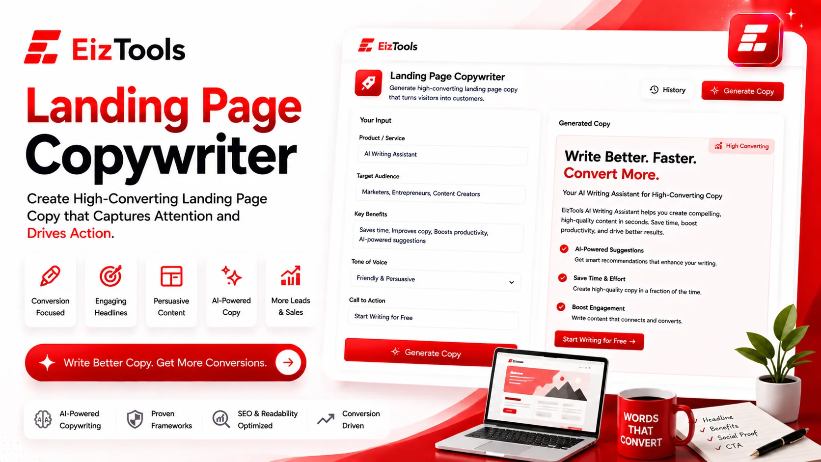
Landing Page Copywriter
AI landing page copywriter
 NVIDIA: Nemotron 3 Ultra (free)





Your prompt will appear here…
Your beautifully formatted article will appear here once you generate.
No history yet
Your generations will appear here. Sign in to save them permanently.
A landing page has exactly one job: turn a visitor into a lead or a buyer before they leave. Most pages never get the chance. They open with a vague mission statement, list every feature the product has ever shipped, and scatter three competing buttons across the top. The reader clicks away — not because the offer was weak, but because the page made them work to understand it.
Strong landing page copy is a discipline, not a stroke of talent. A short list of principles separates pages that convert from pages that merely describe, and each one maps to a section you have to write. Below are the principles that matter most, plus how the Landing Page Copywriter helps you produce each piece without staring at a blank screen.
Lead with one clear promise
Your headline is the entire page compressed into one line. If a visitor reads it and still can't tell what they get, nothing underneath it will save you. The best headlines name a single outcome the reader already wants and hint that it's close: "Get paid in two clicks," "Book more calls without cold emailing," "A recruiter-ready resume in ten minutes."
The temptation is to say everything at once. Resist it — one page, one promise. Before you write a single line, get clear on what you actually stand for; a sharp Brand Positioning Statement hands you the core promise that every headline and subhead should reinforce. From there the tool drafts a headline and a supporting subhead that expand that promise into a concrete "here's how," so the top of your page reads as one confident idea, not five competing ones.
Write benefits, not features
Features describe the product. Benefits describe the reader's better day, and that is what visitors care about. A feature list answers "what is it?"; a benefit answers "what's in it for me?" — and that second question is the only one a landing page has to answer well.
"256-bit encryption" tells people what you built. "Your files stay yours, even if your laptop is stolen" tells them why they should care.
The "so what?" test
The habit worth building is translation. Take each feature, ask "so what?", and keep asking until you reach a human outcome. Then keep only the bullets that survive the question:
- Instead of "automated syncing," you promise "your work is backed up before you think to worry about it."
- Instead of "multi-currency support," you promise "invoice a client in Tokyo as easily as one down the street."
- Instead of "role-based permissions," you promise "the right people see the right things, with no spreadsheet to babysit."
The tool turns these into short, scannable bullets that lead with the payoff rather than the mechanism, so your page reads like a list of reasons to say yes, not a spec sheet.
Back every claim with proof
Bold promises raise a quiet objection: says who? Social proof answers it before it hardens into a reason to leave. Testimonials, recognizable customer logos, star ratings, a specific user count, a named result — these lift conversions more than another round of adjectives ever will.
The wording still counts. A testimonial that says "great product!" is wallpaper; one that says "cut our onboarding from three weeks to four days" is evidence. The tool helps you frame proof points and drop short, specific quotes next to the claims they support, so credibility travels with every promise instead of sitting in a lonely carousel at the bottom of the page.
Point the page at one action
Every landing page should ask for exactly one thing. Sign up, book a demo, buy, download — choose the single next step and repeat it. Two competing calls to action split the reader's attention and depress both. Button copy should name the action and, wherever possible, the reward: "Start my free trial" beats "Submit," and "Send me the guide" beats "Download."
Placement matters as much as wording. Put the primary call to action above the fold, again after you've made your case, and once more at the end for the reader who scrolled straight down. The tool generates CTA variants tuned to the promise at the top of the page, so the ask stays consistent from the first screen to the last.
Remove friction before the click
Friction is everything standing between wanting to act and acting. A form with nine fields, jargon that forces a re-read, a wall of text with no landmarks, an unanswered "what does this cost?" — every one of them is an exit. The remedy is subtraction. Ask only for what you truly need. Break copy into short paragraphs and scannable lists. Answer the two or three objections a real prospect would raise, right there on the page.
Clarity is the cheapest conversion lever you have. If you already have a draft that runs long or drifts off-tone, run it through the Content Rewriter to tighten the language and cut the hedging before it ships. Clean copy doesn't only read better — it removes the small hesitations that quietly cost you sign-ups.
A repeatable writing routine
Put the principles in order and you have a process you can run for any page:
- Nail the one promise and write the headline before anything else.
- Translate every feature into a benefit, then drop the bullets that fail the "so what?" test.
- Slot proof next to your biggest claims.
- Pick one action and repeat its call at the top, the middle, and the end.
- Cut the extra form fields, the jargon, and the questions you left unanswered.
That flow is where the Landing Page Copywriter earns its place — it handles the first draft so your time goes to editing and testing instead of fighting a blank page. Generate a set of headlines, a block of benefit bullets, and a few CTA options, then cut the weakest and publish. A page that keeps one promise, proves it, and asks for one clear action will out-convert a prettier page that does none of those things, every single time.
Sabir Bepari
Founder of EizTools and a passionate AI enthusiast dedicated to building practical, user-friendly AI tools that simplify everyday tasks.